
Becker Design & Media Group Ltd — Saskatoon, SKEst. 2012 · hundreds of builds · this is one of them
Let’s Talk
Home / Our Work / Brightside Dental Studio← All projects
Health Care & Dental Clinics

Brightside Dental Studio

Designed, developed, and looked after by Becker Design. This is one of hundreds of websites we've shipped over the years, and one of dozens of hand-built websites you can explore in our portfolio of recent builds.

Live at — brightsidedental.ca
Brightside Dental Studio website by Becker Design
Fig. 01 — Brightside Dental StudioHealth Care & Dental Clinics
Overview

Web Design & Development Project Overview

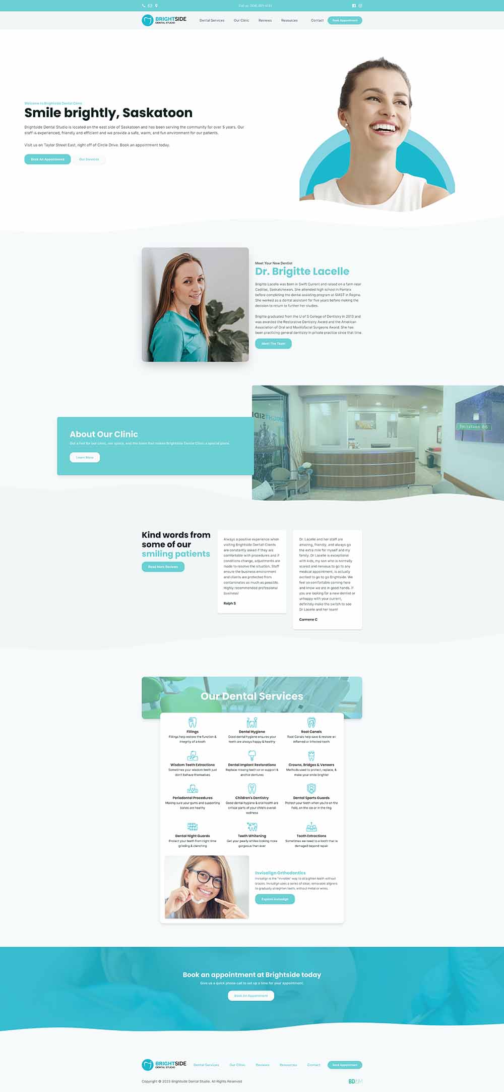
Almost nobody searches for a dentist. They search for the thing that’s wrong — a cracked filling, a wisdom tooth, a night guard their partner has been nagging them about, Invisalign for a kid who’s turning fourteen. Thirteen of those searches have their own page on the Brightside site, each one written for the person typing that exact phrase into their phone.

The second question is always insurance, and it’s the one dental websites usually leave to the front desk. Brightside’s patient resources page carries the intake form as a download — fill it in at your kitchen table instead of on a clipboard in the waiting room — alongside the current CDCP and College fee guides and a way to check coverage. It’s the least glamorous part of the build by a distance, and it’s the part aimed squarely at the questions the front desk fields all day.

The rest is a soft palette, a lot of white space, and the clinic’s own people on the about page. A dental office is a place people are already nervous about walking into. The website’s job is to make it look like somewhere calm.
Full-page captures

The whole site, top to bottom

Take a glance at full pages, exactly as they shipped.

  • Full-page capture of the Brightside Dental Studio website
    Fig. 02 — Brightside Dental StudioFull page
  • Full-page capture of the Brightside Dental Studio website
    Fig. 03 — Brightside Dental StudioFull page

Hover a capture to pan top → bottom · static on touch

Case study

Deep Dive

What actually went into Brightside Dental Studio’s build, decision by decision — and the service behind each one.

  • 01

    Nobody searches for a dentist

    They search for the thing that is wrong — a cracked filling, a wisdom tooth, a night guard, Invisalign for a teenager. Thirteen procedures are written up individually, aimed at the person typing that exact phrase rather than at somebody browsing a clinic. The plain dentist search is the one you win last, not the one you start with.

    Where this goes deeperDental Clinics
  • 02

    The second question is always coverage

    Most dental websites hand that one straight to the front desk. This one puts the intake form up as a download, so it can be filled in at a kitchen table instead of on a clipboard, alongside the current national and provincial fee guides and a way to check what a plan actually pays for. Unglamorous, and it answers the call before it happens.

    Where this goes deeperWordPress Design
  • 03

    A room people are already nervous about

    Soft colours, a lot of white space, short pages, and the clinic's own staff with their names attached. Dental anxiety is common and real, and a website is the first room a patient walks into. Making that room calm is not decoration — it is the difference between somebody booking and somebody closing the tab.

    Where this goes deeperResponsive Web Design